
From MVP to Claim Management:
Leveraging Research and Service Design to Go from Fragmented Experiences to Clear, Trackable Travel Claims on VA.gov
SERVICE DESIGN / USER RESEARCH / UX STRATEGY
Image created by VA News
Timeframe: 18 months My Role: solo Researcher
In just 18 months, my team and I transformed the long-standing VA Travel Claims challenge into a streamlined, research-backed digital experience. By starting small, listening closely to users, and iterating based on real behavior, I worked with my team to discover, define and deliver:
A clear MVP: the Travel Claim Status page
A second-generation tool: the Travel Claim Details page
The Challenge: Fragmented Paths, Unclear Statuses, and the Search for an MVP
The team began its work in late 2023 with a clear vision: deliver a seamless, positive experience for any Veteran or caregiver managing travel reimbursement online. Early research revealed a major gap—Veterans could file claims in multiple ways, but could not monitor those claims on VA.gov, forcing them into BTSSS even if they submitted claims somewhere else. Veterans lacked transparency, especially when a claim was denied or delayed, and had no easy way to understand why a decision was made.
Identifying the MVP
To determine what to build first, I used service blueprints and journey diagrams that mapped every step of a simple claim, from an appointment to payment. These revealed a repeated problem: Veterans needed visibility, not new functionality. Status transparency became the anchor point.
The result: the MVP would be a Claim Status page on VA.gov—a single place to monitor travel claims regardless of where submission occurred.
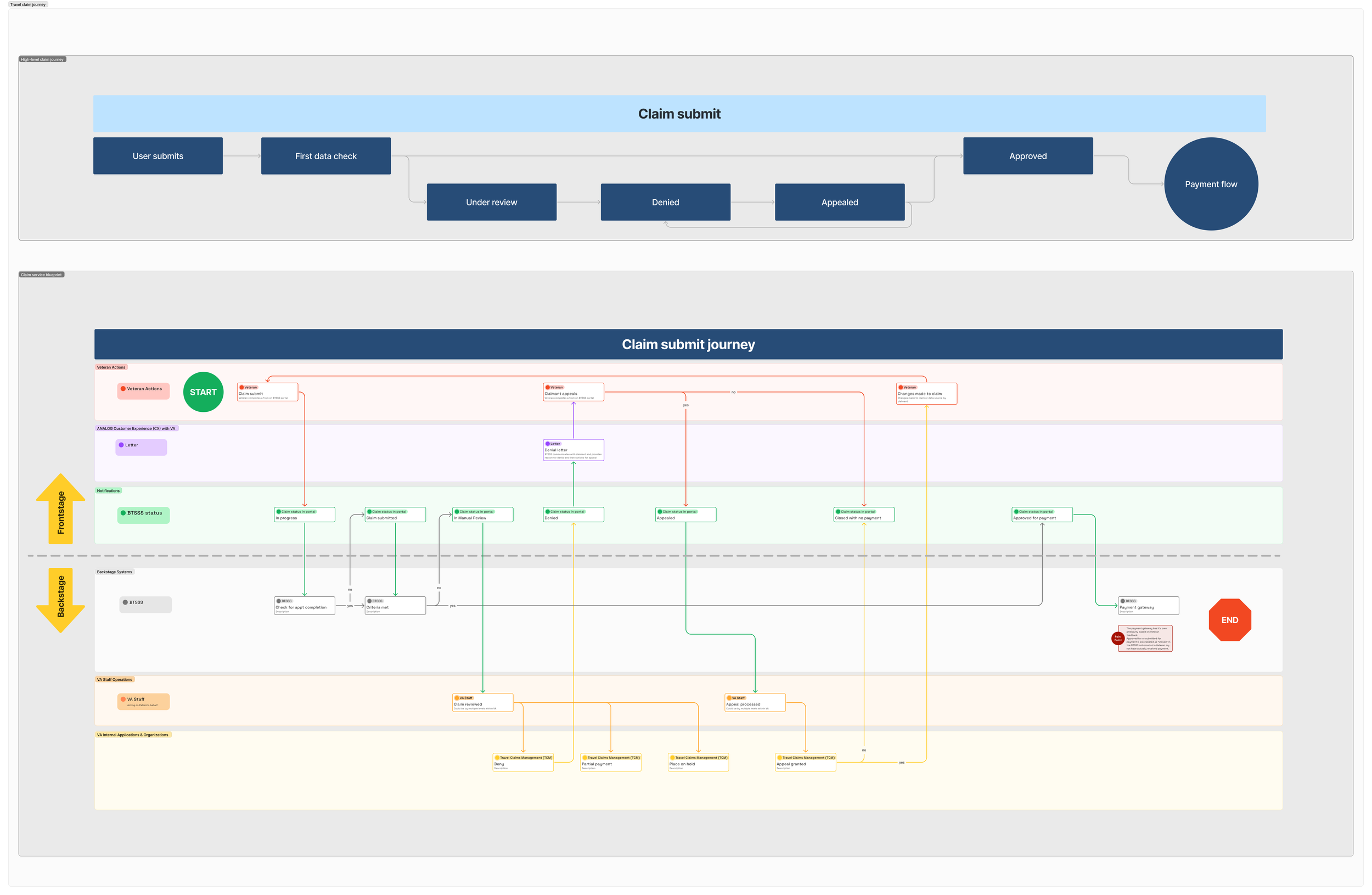
Image A: Service blueprint
The Approach: Finding the MVP using Evidence from Real Users
Once the MVP was defined, I focused on two core questions:
Where should Veterans find the new Status page on VA.gov?
What should the page look like, say, and enable?
Step 1: Tree testing to determine placement
Finding: Veterans’ mental models were scattered
In February 2024, I conducted tree test with 66 Veterans confirmed the complexity of the current user experience: participants tried to locate travel claim information under many different sections—MyHealtheVet, My VA, Claims and Appeals—revealing there was no clear or intuitive home for travel reimbursement tracking. Despite varied navigation paths, most Veterans associated travel reimbursement with claim submission and claim management tools already on VA.gov. The IA study showed no universally obvious path, but MyHealtheVet and Claims & Appeals emerged as the most successful entry points. Veterans force-ranked “Travel Reimbursement Status” as the clearest label for the new page, reinforcing that language must be explicit and action-oriented.
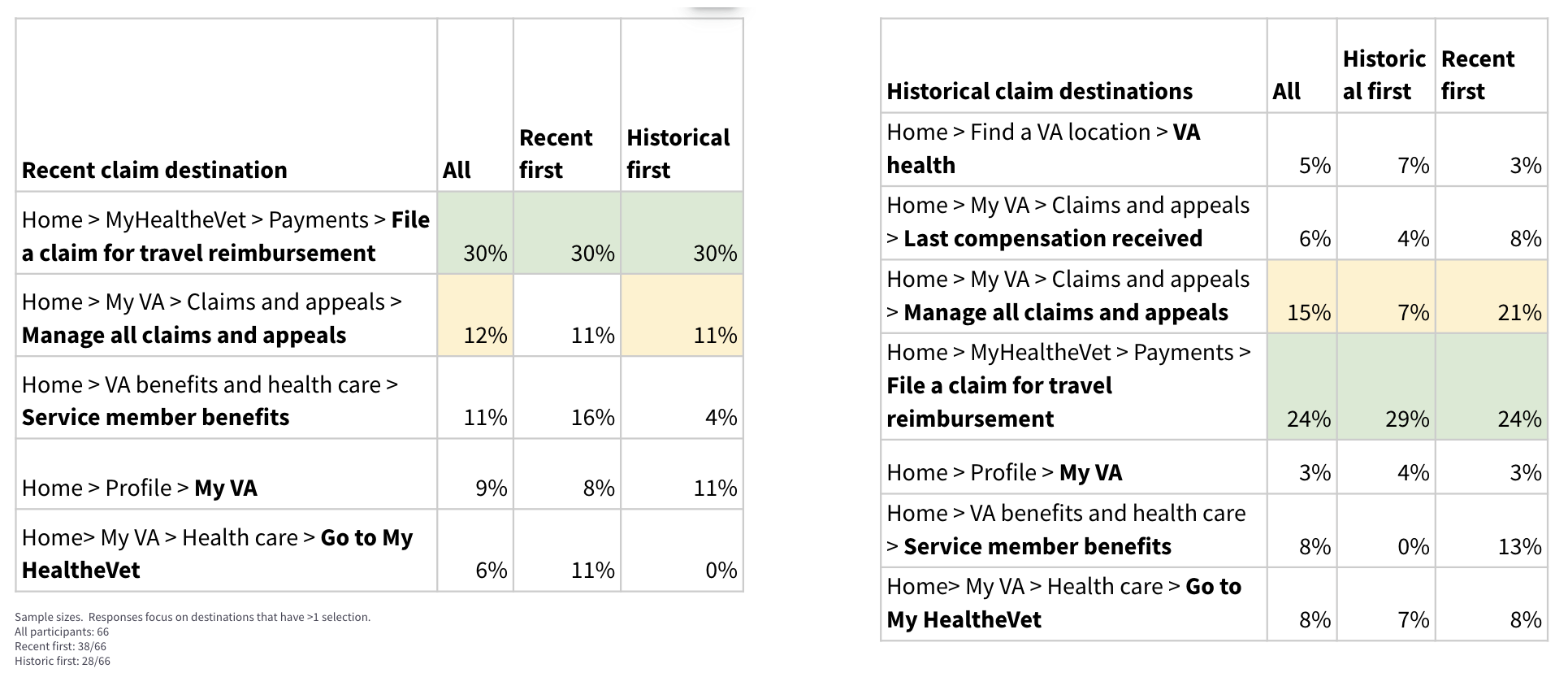
Table A used to analyze findings from tree test. Read the full tree test study here.
Step 2: Look-and-feel usability testing shaped the design and content
The tree study showed split signal. So in May 2024 I conducted a prototype study with nine Veterans revealed several critical findings:
Most participants “satisficed”—they clicked the first reasonable link they saw, often from the unauthenticated homepage’s “Top Pages.” This in person study allowed us to see the different entry paths users might take and account for that when placing entry points throughout the whole website.
All participants understood the purpose and layout of the new status page.
Every participant wanted to know why a claim was in a certain status—especially when denied or delayed.
Veterans expected to be able to take action—appeal a denial, follow up, or understand next steps—directly from the page.
These insights directly influenced the MVP’s layout, labels, and the inclusion of a Help section and claim-level detail indicators.
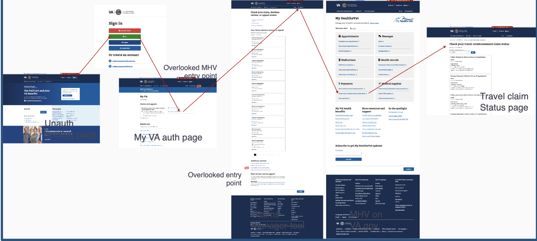
Image B: visualizing one of the main entry paths observed in testing
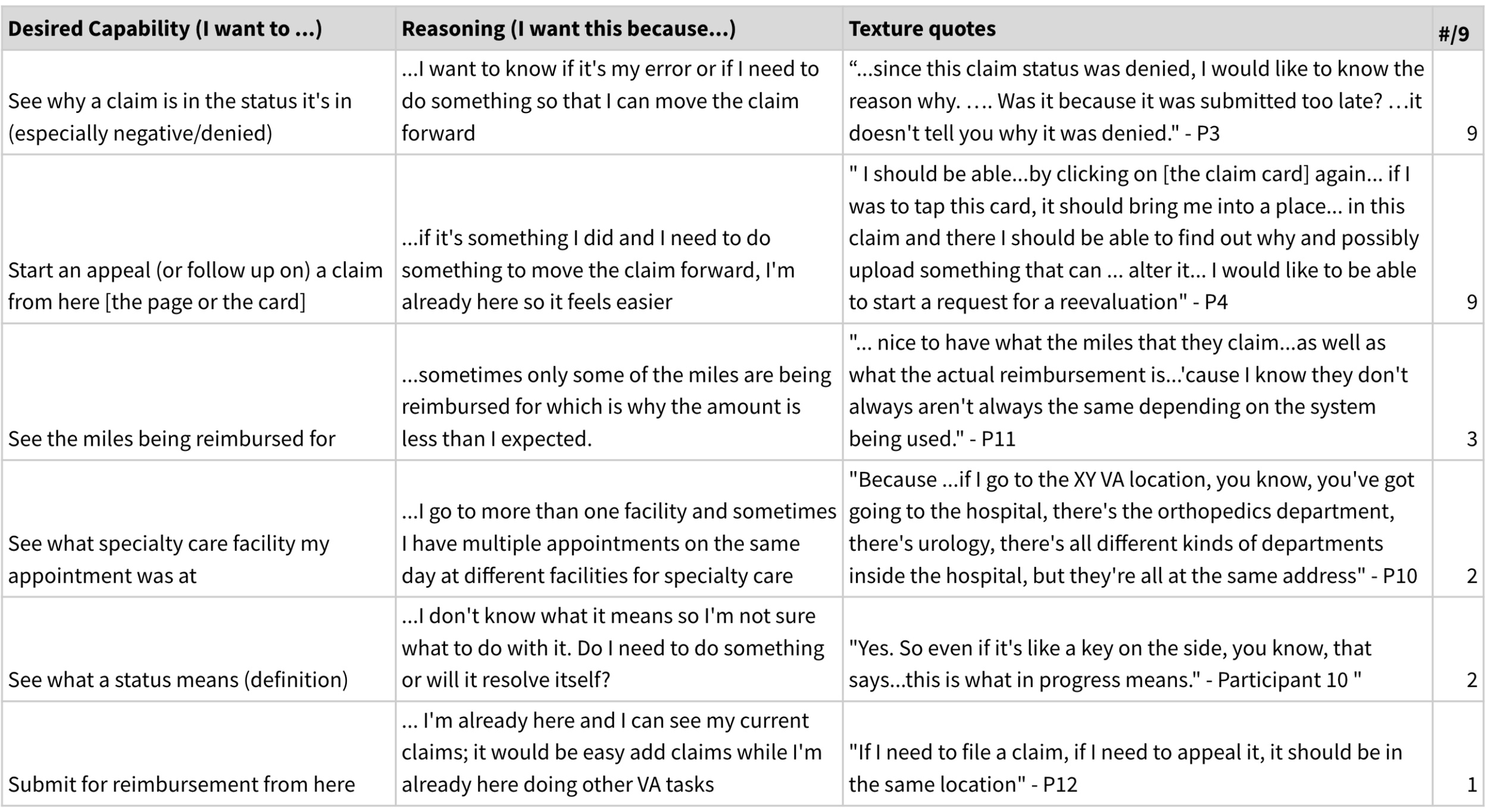
Image C: How I framed what we should focus on in presentations to stakeholders
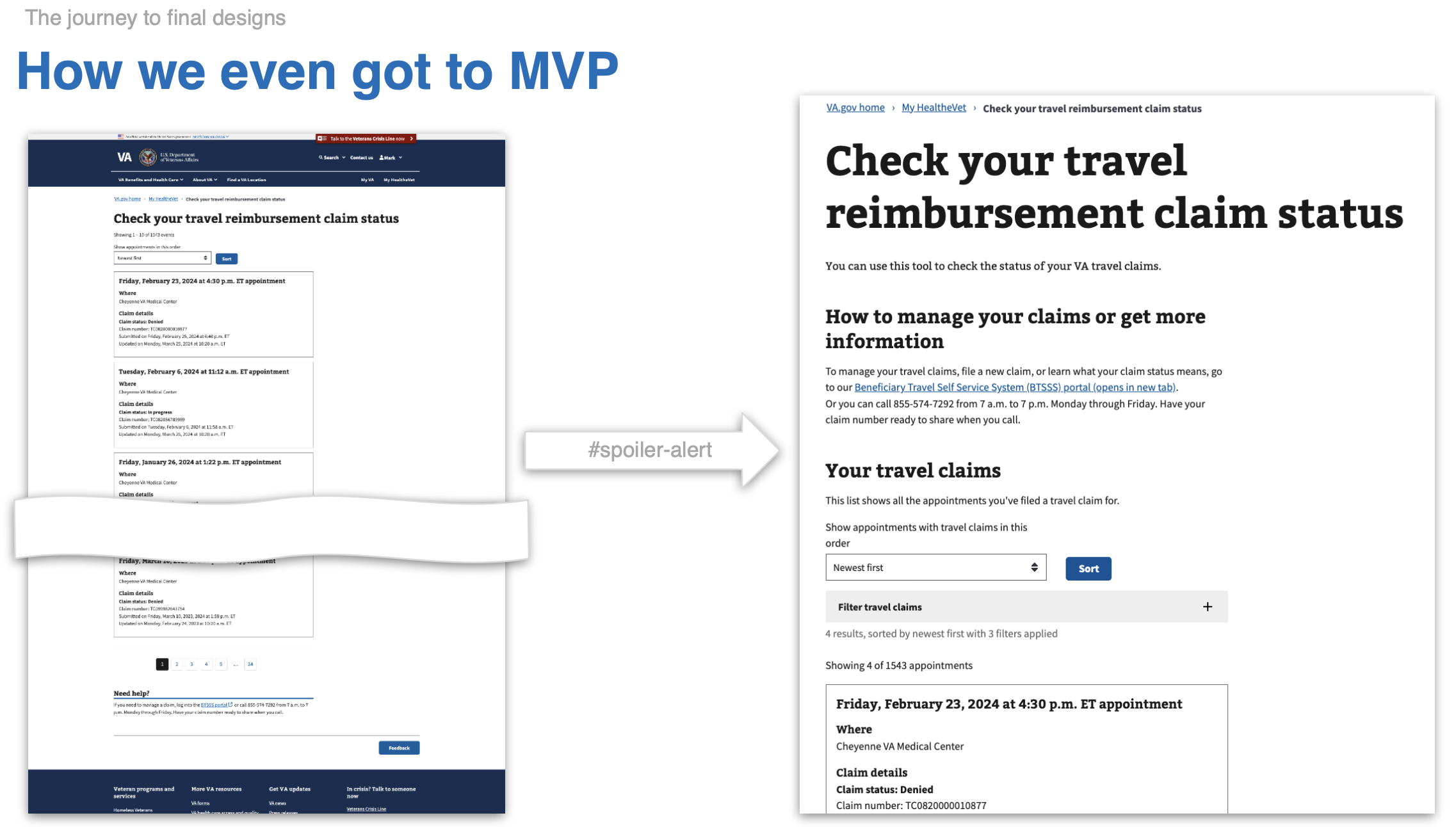
Image D: In final designs, we added Help content and reorganized the page. Read the full study here.
3. The Outcome: Launching the Status Page and Evolving to the Travel Claim Details Page
The MVP goes live
The Travel Claim Status page launched in January 2025. Over the first 30 days there were:
49,705 page views
33,061 unique users
An average engagement time of 1 minute 38 seconds
As I monitored user feedback from Medallia forms, I saw that again and again Veterans asked: Why is this happening? Why was my claim denied? and Where is my payment? Qualitative feedback underscored the importance of next-step clarity. Many Veterans reported confusion about statuses like “Manual review” or “Payment canceled” and wanted clearer explanations. Others noted mismatched expectations, such as a payment marked “Paid” but not yet received. These insights reinforced that the MVP solved visibility but not yet interpretation.
Iterating forward: The Travel Claim Details page
Using these findings, I moved the team to the next evolution—a deep-dive into claim status language and users’ mental model of the claim process and a comprehensive Travel Claim Details page. In the Status Language generative study I conducted in-depth exercise driven interviews with 16 Veterans. This allowed me to visualize how users’ imagine the claim process process and call out where we had opportunities to improve their experience.
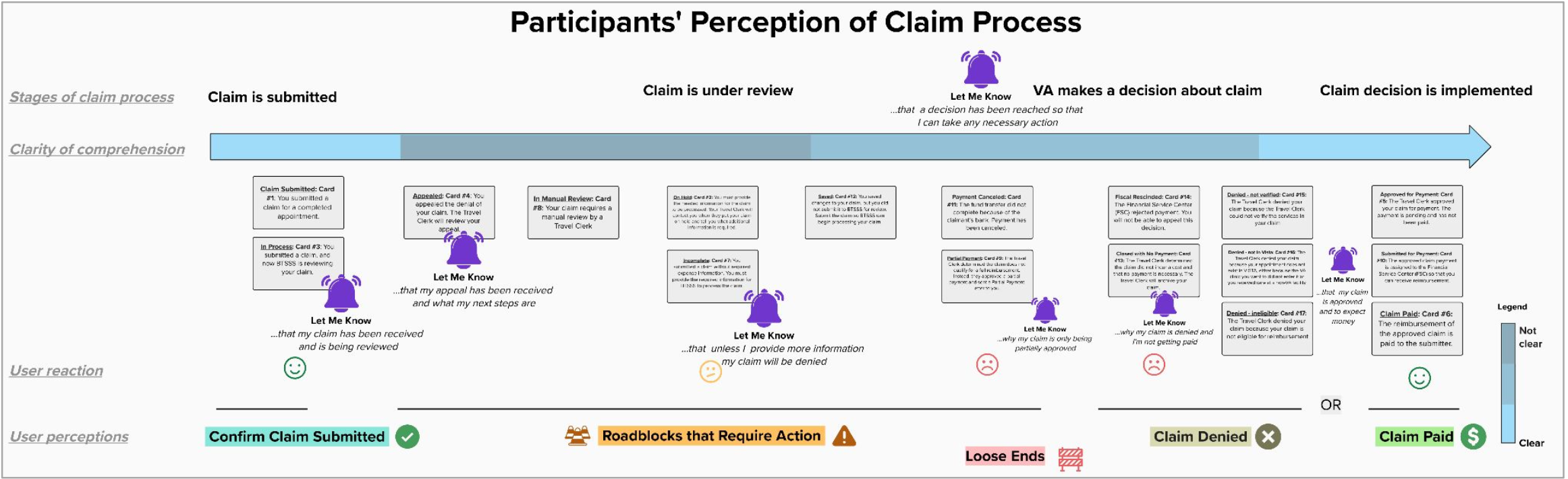
Image E: Participants’ perception of the claim journey
After testing and iterating, the new Travel Claims Details page addressed the biggest gaps Veterans identified:
Explanations for status and decision reasoning
Ability to download decision letters
Transparency around reimbursed vs. submitted amount (including deductible gaps)
Clear appeal options and next-step instructions
Display of documents submitted and payment history details
Testing confirmed that Veterans could now find detailed answers quickly—especially around partial payments, denials, and what to do next.
From Uncertainty to Clarity for Veterans
In just 18 months, the VA.gov Travel Pay team transformed a long-standing challenge into a streamlined, research-backed digital experience. By starting small, listening closely to Veterans, and iterating based on real behavior, we delivered:
A clear MVP: the Travel Claim Status page
A second-generation tool: the Travel Claim Details page
A foundation for future enhancements—including in-app submissions and multi-platform expansion