
Fast, Focused, and Strategic:
How Rapid Research Drove a Critical UX Decision
Rapid Research and Usability
Timeframe: 3 weeks My Role: solo Researcher
When our team developing an intelligent assistant for a large financial institution encountered a major technical hiccup, we had to decide fast how to keep users engaged—without compromising the long-term user experience. Over three weeks I turned that urgency into insight, balancing research speed with rigor using a combination of unmoderated tests. This is how I empowered the team to make confident decisions under pressure—and what I learned about running lean but effective UX research when the clock is ticking.
The Challenge: A Temporary Fix With Long-Term Consequences
My team working on the Intelligent Assistant encountered a technical hiccup that blocked the intended experience from shipping on time. Engineering and UX Design were left with two potential concepts that could function as a temporary solution while the issue was resolved.
The pressure was immediate. The team needed to move fast—but speed alone wasn’t the goal. A poorly chosen stopgap could confuse users, frustrate them at a critical moment, and ultimately turn them off from using the assistant once the full feature launched. That’s where I come in. The challenge became strategic as much as tactical:
How do you quickly choose an interim solution without compromising future adoption?
The Approach: Research Designed to Answer the Right Questions
The work began with alignment. I organized and facilitated a kickoff workshop that brought together Product, UX Design, and Conversation Design stakeholders to prioritize the most important questions that would differentiate the two concepts. Before running any new studies, I reviewed existing research to confirm what was already known. This allowed me to focus squarely on unanswered questions—ensuring every study would directly support decision-making.
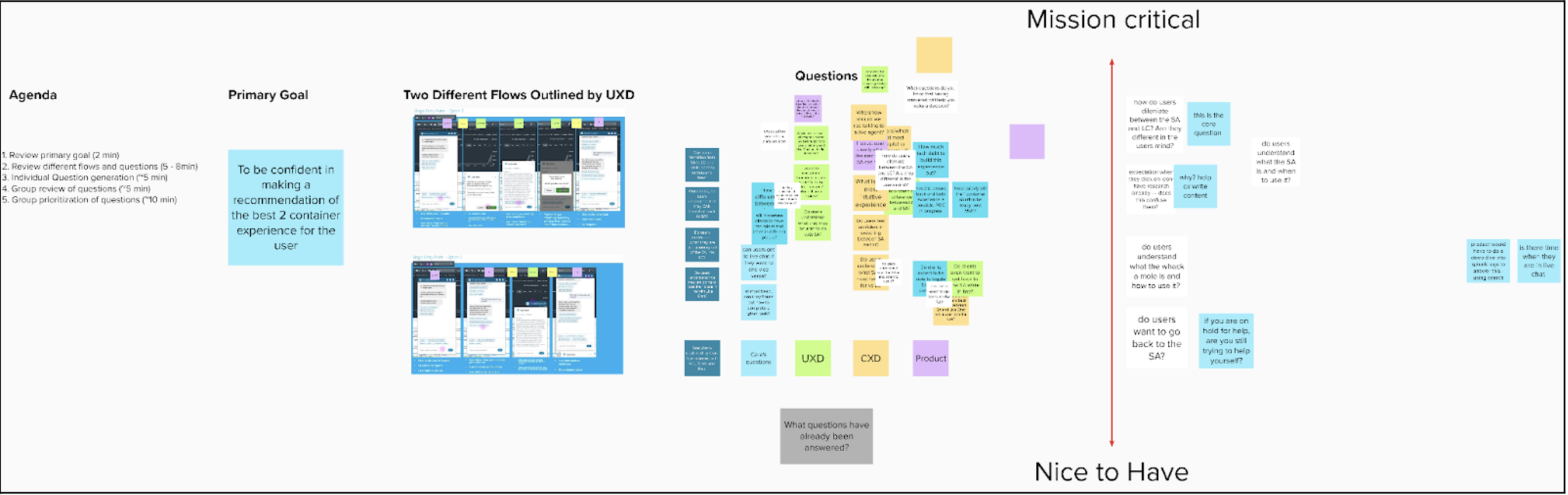
Image A: Research kickoff framework
Testing Real User Intent—At Speed
To move quickly, I relied on unmoderated testing using UserZoom. Over roughly three weeks (part-time), data was collected from 126 target users across three studies:
Two comparative usability tests (unmoderated testing via UserZoom)
26 users total
10–20 minutes per participant
Identical tasks across both concepts
Each usability test followed the same task structure so the two concepts could be compared directly under identical conditions.
Participants were asked to complete realistic, high-stakes actions. For example:
“Now you want to talk to a customer support team member to assist you in canceling your transfer. From here, enter the forum to speak with a member of the customer support team. You will be successful once you are waiting for a customer support member to enter your conversation. When you think you have been successful, click the ‘Success’ button. Remember to think out loud.”
This task grounded the research in real user needs, not hypothetical scenarios— revealing how well each concept supported moments that actually matter.
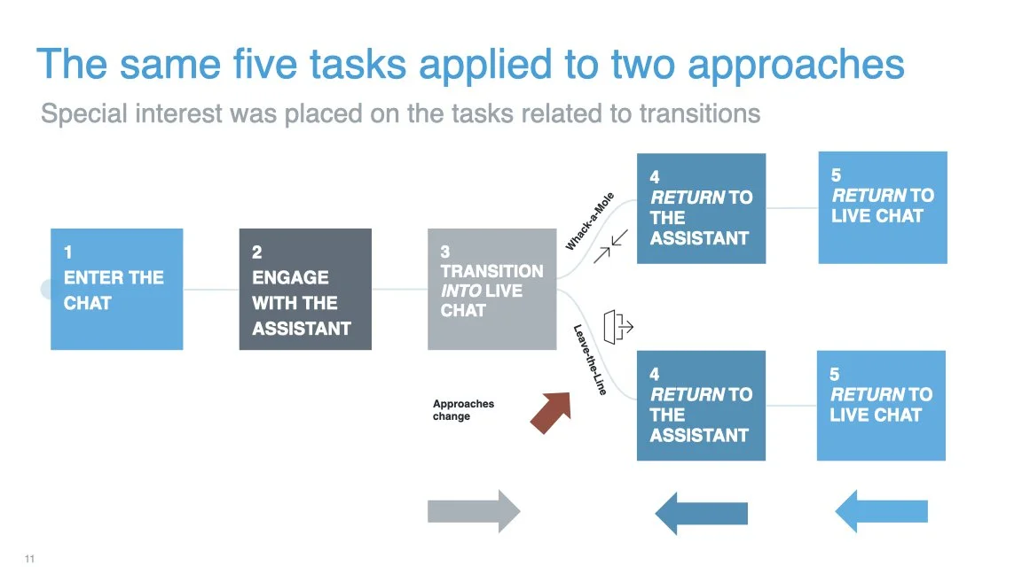
Image B: the user flows tested
One expectations survey
100 users
A mix of first-click tests and open-ended questions
The expectations survey focused on how users interpreted the experience at first glance—before completing any tasks.
“Imagine that you want to have a conversation with Schwab and tell Schwab to cancel a transaction you recently made. Looking at this screen, click on where you are looking to know who or what you are speaking to at this moment.”
This click test surfaced critical insights about clarity, trust, and mental models—particularly around whether users believed they were interacting with a human, a bot, or a hybrid system.
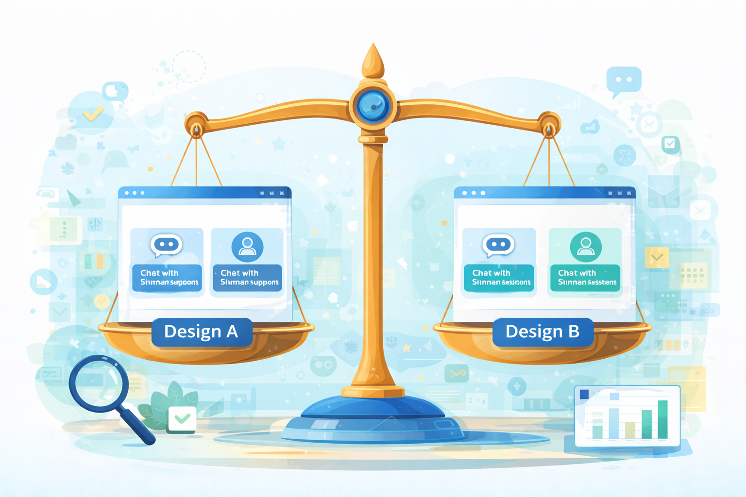
The Outcome: Clear Recommendations, Confident Decisions
The research produced decisive findings that allowed the team to move forward with confidence.
When presenting results, I focused on:
Where the two concepts behaved similarly
Where they diverged in meaningful ways
How those differences would impact real user journeys
Rather than overwhelming stakeholders with raw data, I oriented insights into a clear comparative frameworks that made trade-offs visible and actionable.
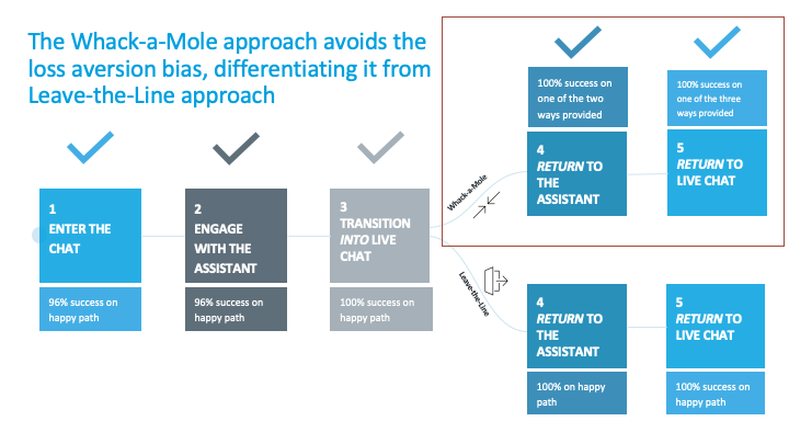
Image C: Concept comparison or recommendation framework
Making User Behavior Visible
I brought insights to life by using:
Annotated screenshots highlighting moments of hesitation or success
Video montages showing users navigating key flows
Heat maps from click testing, which quickly communicated what users focused on—or overlooked—screen by screen
These artifacts helped me identify and communicate the turning points in the user journey, while higher-level measures like SUS scores provided a holistic view of the experience.
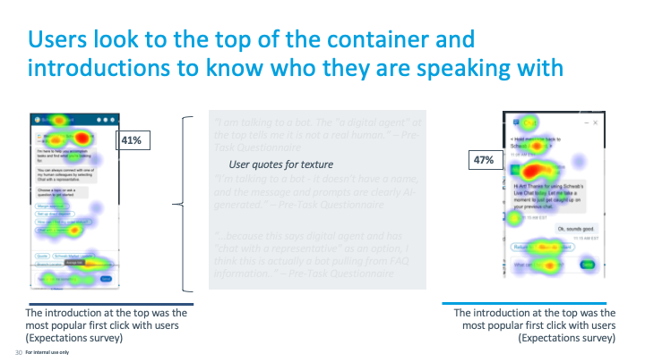
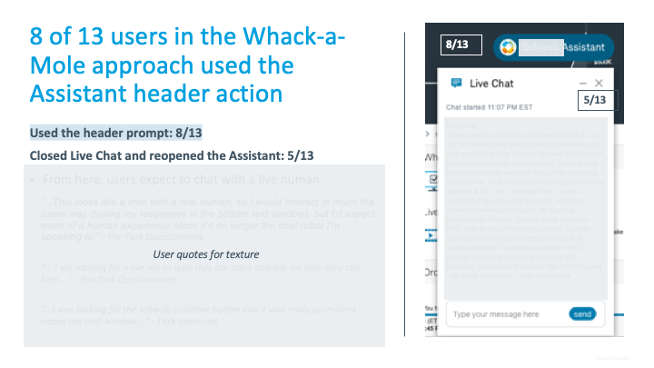
Image D: Click-test heatmaps Image placeholder: Annotated screens with callouts.
Final Result
With research-backed clarity, the design team aligned on a direction and engineering began building immediately. The selected stopgap solution minimized risk, preserved user trust, and kept development moving forward.
When the full Intelligent Assistant experience was ready, the temporary solution was retired—having done exactly what it was meant to do.
In a moment where speed could have forced assumptions, research became the strategic advantage, ensuring fast decisions were also the right ones.